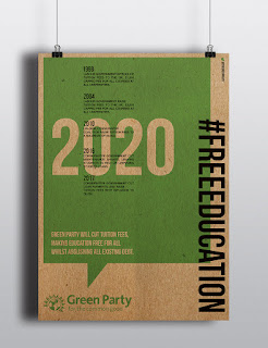
I believe that my series of multifunction
designs that could either be printed as flyers or posters have been successful in
meeting my desired brief. I wanted to give the already existing brand identity
of the green party a much needed refreshed advertising campaign focused towards
gaining notoriety amongst their target demographic. I believe my design is
successful in this by being design conscious it is modern and something new, resembling
both the new policies the green party would employ as well as showing a focus
towards creating something which young people, who make up majority of their
voters, would be interested in looking at. ‘advertising
actions and their implementation, involves starting afresh and considering the
recipient of the advertising message as the main axis of the analytical study.’
Pedro Alameda Abejón, 2006. This is something I wanted to take into
consideration of my design, the design needed to be new and relevant in order
to be relatable to their target audience. I believe my design also achieved the
goals I set myself in the brief by making it environmentally friendly, creating
the physical final outcomes themselves out of recycled paper, creating an item
which in itself relays the beliefs of the Green Party. The typography I chose
coincided with the existing branding for the party, and therefore allowed me to
create a piece that could slot in with its current brand identity to gain them
more awareness, ‘awareness represents
the lowest end of a continuum of brand knowledge that ranges from simple
recognition of the brand name to a highly developed cogitative structure based
on detailed information.’ W. Hoyer, S. Brown, 1990. The idea that these posters
reaffirm the existing brand identity acts as an enabler for the beginning of awareness,
which will hopefully lead to trust and therefore votes. The particular green
that is used floods the page and gives the audience this visual link between
that type of green and the Green Party campaign, meaning as the posters and
flyers were released more and more they would get this recognition; not just
reminding them of the brand itself but also the what the brand represents, the
policies on each of the posters. When placed in the areas that these issues are
prominent the audience will gain an emotional attachment to wanting them to be
resolved, this is when emotional branding comes in, the branding itself could
evoke emotion and passion in a subject for the audience reminding them of the
green party’s policies to resolves said relevant issues. As discussed by Craig J. Thompson, Aric Rindfleisch and Zeynep
Arsel, In the Journal of Marketing, ‘From
an emotional-branding standpoint, brand strategists should focus on telling a
story that inspire and captivate consumers. These stories must demonstrate a genuine
understanding of consumers’ lifestyles, dreams, and goals and compelling
represent how the brand can enrich their lives’. This was important for me to
include in my work cause if people understand how the policy changes could affect
them through visual techniques it would therefore make my brief successful in
creating a campaign of advertising that gives the Green Party greater notoriety.
Overall I am happy with my design, and the feedback I have received from
my final physical object, although if I didn’t have a time constraint I would
like to further visually explore my ideas. This would be through exploring the
idea of the green speech bubble within different parts of their branding, and
promotional material such as their website. I would also experiment with making
my prints through screen printing, as it would technically be better for the
environment and take the brands values in their promotion into greater depth.
1.
Brand notoriety and the communication media, Pedro Alameda Abejón, 2006, http://www.esic.edu/documentos/revistas/esicmk/070118_130317_I.pdf
(p.66)
2.
Jstor.org.
(2017). Effects of Brand Awareness on Choice for a Common, Repeat-Purchase
Product on JSTOR. [online]


No comments:
Post a Comment