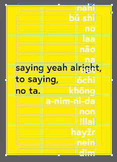
The zine itself didn't follow any guidelines in terms of it was not designed for a specific client, in order to combat this I designed in a way which was conceptually representative of multiple different reasonings. This is easier to do within this type of zine, as it was aimed towards designers and therefore there we should be able to understand the subliminal messaging that is put into the design of the actual outcome. Due to this factor wanted to keep the visual representation rather conceptual, showing a meaning throughout the book itself.
 |
| Figure 1 |
 |
| figure 2 |
 |
| figure 3 |
 |
| Figure 4 |
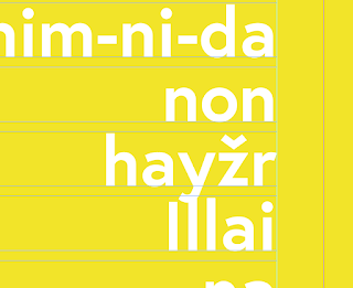
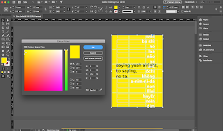
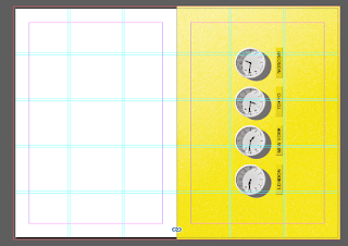
The only other colours that should be used within this zine is black and white, these are both the two highest contrasting colours against yellow on the spectrum; and therefore will both show up but in different lights. Meaning when both white and black is on the page black takes predominance in the visuals of the audience, yet the white is still visible as can be seen above in figure 4.
 |
| Figure 5 |
 |
| Figure 6 |
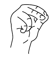
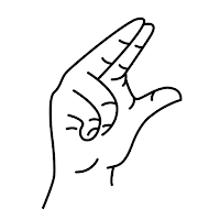
Within the centre of the zine to break up the amount of text I added a small illustration, this then again plays on the idea of the colloquial style, in terms of the title referring to something which you would not expect. The younger generation think of saying no without saying words there are connotations attached to a certain particular type of sign language, normally associated with the middle finger, this gives an alternative to that saying that professionally you can say no using sign language and gives a step-by-step instruction through the illustrations; This reference can be found within the small text. This is created is almost a sarcastic joke, something which young designers are seen to engage with, and therefore keep them interested within the publication.
Each of the points which are positive reasons to say no to a client are summarised with a small title at the top of the page this is then reaffirmed by a quote from a designer. The quotes from the designers rule from industry-standard level design is meaning that the new designers and students who would be reading this publication would be inspired by people who agree with the opinion of the zine, and has seen to be successful. Originally I experimented with adding just famous quotes but I believe by adding them from designers themselves it makes the quotes more relatable for the audience.
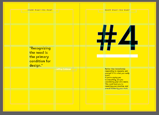
The quotes don't directly linked to the explanation, but do make sense alongside the explanation. For example the design above shows a quote about recognising the need is the primary condition for design, and the positive about saying no here is about knowing what you want. The link between the two is the fact that by not rushing into everything and saying no to some clients you are showing that you know what you want.
Each spread apart from the centre spread features a large number, this is accompanied by a hashtag which is counting the positives of saying no overall there are six positives. Through adding the numbers it adds a sense of dimensions in terms of telling the audience that there's more than one positive to saying no and reassuring them that it is okay to do so. The colour black was chosen to draw the eye to the straight away there underlined with a thick but even white lines throughout the zine, further highlighting the numbers on each page this also adds a sense of separation between the explanation and the number itself. Furthermore this encourages consistency throughout the design as white is featured both on the front and back cover.
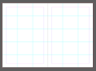
As can be seen above from all of the figures each of my designs within kept strictly within the grid this is to represent the way which in professionalism it is not seen to be okay to say no. Yet this is contradicted with both the colour and type choices as previously discussed, and therefore I believe keeping it both in the grid and to a structure throughout the book adds design consistency, yet also adds a sense of contrast between the design choices themselves and the structural layout choices of the zine.
Process:
The scene was printed in the digital print room on double sided Olin regular 120 GSM paper, apart from the cover which was printed on a thicker weight (300 gsm) in order to give the buckets tactile nature to be able to be handed out passed around and also we referred back to at a later date.
Before the book itself was bound it was printed on a 3 to ensure a full bleed the fold was then created through the use of the folding machine to ensure a concise and accurate fold throughout both of the booklets. A staple binding machine was then used to again improve the accuracy of the binding itself, through doing so it is yet again producing the most professional outcome; and therefore creating the best industry standard zine style which is appropriate for the design, ensuring that the design would work if put into context.


No comments:
Post a Comment