Colour theory:

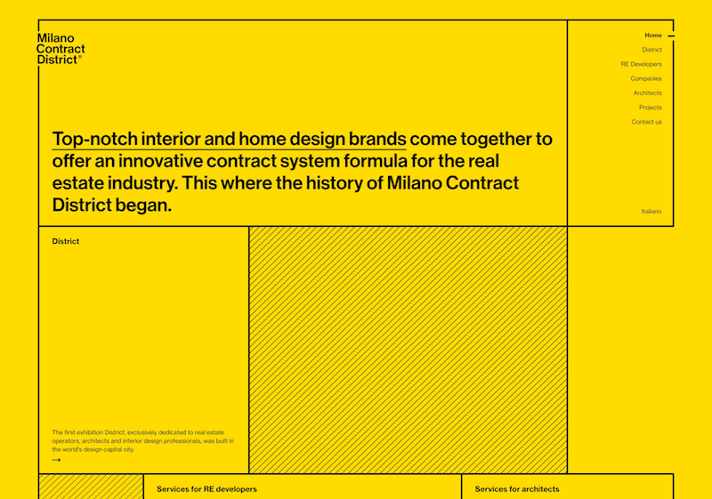
The colours that I will be using should be representative of the meaning of the zine itself, the scene is trying to inspire and engage with young designers to be able to get the confidence and the ability to say no.
Therefore I decided to look at the warm colour spectrum, warm colours include red orange and yellow and variations of these three colours. These are the colours of fire and a full leaves and sunsets and sunrises are generally thought of his energising passion and positive.
This therefore suits the style of the zine I am creating, as I'm take the perception of saying no from being negative to making gets into a positive and energetic thing, which overall will make you more passionate about your design through the abilities that allows you to do.

I decided the use of yellow would be considered the brightest and most energetic of the colours, it associated with happiness. Although in turn it is also associated with the idea of cowardice and deceit, coming from the saying yellow belly, meaning cowardice. The mix connotations and emotions that are associated with yellow make it perfect for the design, as yellow means cowardice but also can represent passion. Similar to the way in which people see designers that say no is cowering out of their design work, when realistically this will help them be more passionate in the long term.
Visual References:


Type Considerations:
 |
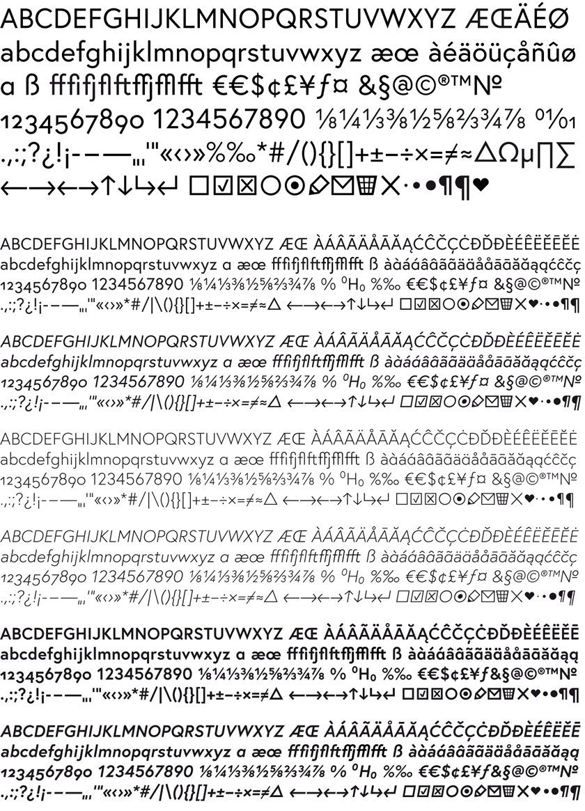
| Europa |
This typeface will also help me in the representation of the use of something so simple, such as saying no, can lead to something much more complex. This is represented through the way in which the type is so simplistic because of its humanist nature, yet when laid into a design itself it can completely change the aesthetic and feel of which the design is conveying.
Layout design:
When it comes to layout I wish to create something which is simplistic and creates a modern and memorable impact, this is something which was identified within the research of the zines. first layout sees a small simplistic image with the title across the double spread above, there would then be a short description of the way in which that benefit of saying no would benefit you as a designer.
The second layout design sees a full bleed image with a contrasting title across the double spread above once again a small description of how that benefit of saying no will benefit you as a designer will be displayed.
Printing and binding considerations:
In terms of printing and binding this publication I will be followed a traditional zine style. Taking into consideration my target audience to see more need to be printed cheaply, bound quickly, and easily be reproduced to be able to cut out en masse reproduction into all universities and sent out to new designers. Therefore the piece will all be digitally printed and bound with simple saddle double up staple. This also ensures that the book will not come apart easily therefore making it tactile for people to be able to view over and over again, and keep as a reference.

No comments:
Post a Comment