 |
| Sofia Pro |
 |
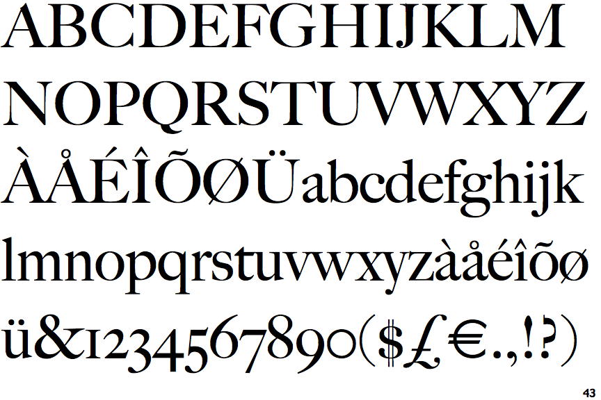
| Big Caslon |
The typefaces which I have chosen to use within my publication, our Sofia Pro and big caslon, both of which have been obtained from Adobe type kit. Sofia Pro officers found san serif easily legible body typeface, which can also be manipulated into a display typeface as once enlarged creates quite an impact due to its nature thick line waiting, giving his humanistic feel, which demands attention, through its contrast against simplistic design. Making it perfect to use within the publication. Big Caslon will be used the logo, and also for any titles within the publication, keeping this typeface solely for these two uses, allows it to be differentiated from the main body text. Due to its traditionalist appearance it also relates to the traditional values of high-end brands in terms of keeping the consumer towards one particular type of person, that of a higher social status; therefore visually linking concepts of high-end brands to the visual impact that my magazine will have on its audience.


No comments:
Post a Comment