- Branded
- Obessesion
- Control
- Restriction
- Monogram
Name selected: Monogram
I have chosen to use the name monogram as I believe it is most appropriate for the kind of magazine I am producing as well as sits well with the content.
a motif of two or more interwoven letters, typically a person's initials, used to identify a personal possession or as a logo.The definition itself talking about personal identity, an issue which I am striving to address in the magazine itself. It is also appropriate as most high-end designer brands possess a monogram, Burberry has recently just redesigned theirs. This is a brand which is highly spoken about in each outcome of this module and therefore believe influenced my decision to select the name as a link between the two pieces.
Logo Development:
I experimented with both sans serif and serif typefaces, I attempted to use a serif typeface to reaffirm the younger audience, and visually confirm the modernity of the magazine. Yet I believe in this context the logo becomes to unimportant visually and the typefaces experimented with would be better suited as body text for the main content of the magazine. The san serif typefaces allow for more of a statement for the audience when initially looking at the cover, it links back to the 'high class' connotations that are associated with traditional values, visually represented through a traditional typeset. This is then bought into a more modern context through the use of a wide kern, allowing for open space in the logo itself compliments the design style of the magazine and makes the logo appear more elegant and independent, traits that designer brands aspire to output; therefore engaging with the consumer who is interested in them and in turn engaging the audience with the magazine.
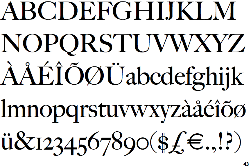
Chosen typeface:
 |
| Big Caslon |

No comments:
Post a Comment