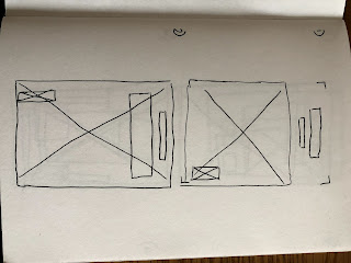
All of these are drawn from the fashion lifestyle magazines that I have previously identified within my research and on the Pinterest collection of images, which has also been previously linked. The main reoccurring theme between the wireframing for these magazines is to have a large image and minimal information on the front. The more mainstream of the magazines such as 'i-D' has more information on the front so they sit more fitting on the shelf alongside the fashion publications in stores. Whereas a lot of the lifestyle magazines that I have looked into are sold in more fitting locations, such as urban outfitters and individual bookstores, rather than newsagents and supermarkets; and therefore have a more minimal setting as they already stand out through the type of imagery and content that are involved in the publication itself. Therefore I have decided to experiment with designs from figure 2 digital, as I believe they best represent a fashion lifestyle magazine and encapture the simplicity that I would like to portray in order to grasp the attention of my target audience.
 |
| Figure 1 |
 |
| Figure 2 |
 |
| Figure 3 |
 |
| Figure 4 |
 |
| Figure 5 |
No comments:
Post a Comment