Monday, 17 December 2018

Chosen Typefaces

Sofia Pro
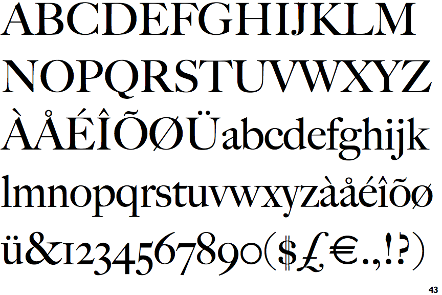
Big Caslon
The typefaces which I have chosen to use within my publication, our Sofia Pro and big caslon, both of which have been obtained from Adobe type kit. Sofia Pro officers found san serif easily legible body typeface, which can also be manipulated into a display typeface as once enlarged creates quite an impact due to its nature thick line waiting, giving his humanistic feel, which demands attention, through its contrast against simplistic design. Making it perfect to use within the publication. Big Caslon will be used the logo, and also for any titles within the publication, keeping this typeface solely for these two uses, allows it to be differentiated from the main body text. Due to its traditionalist appearance it also relates to the traditional values of high-end brands in terms of keeping the consumer towards one particular type of person, that of a higher social status; therefore visually linking concepts of high-end brands to the visual impact that my magazine will have on its audience.


Ordering Process

As previously discussed rather than making the magazine myself, I will be having it produced externally. This is due to the fact that I want it to feel and be presented as a professional fashion lifestyle magazine, and therefore it must be of professional standard. As I know my production skills when it comes to bookmaking and not of the professional standard the only viable option to be able to achieve an outcome which successfully fulfils the needs of the brief is to have it produced elsewhere. Also due to the low number of pages with the magazine if I were to perfect bind this outcome within the University facilities, unfortunately, it would fall apart, whereas elsewhere have industry-standard level binding materials, which would ensure the books does not fall apart.
In order to comply with the needs of the printing, I created a PDF document my final design with a 3 mm bleed, ensuring that any pages printed through the company which did have a full bleed image or typographical background, would go all the way to the edge of the page. The magazine is quite thin, I do not need to take into consideration the spine, is not a lot of content is lost within a spine that is below 1.5 mm thick.

As can be seen below, I have screenshot it the settings in which the booklet shall be printed, with a 300 GSM silk cover which will be coated in matte lamination, and 130 GSM silk paper to give the feel of a professional magazine. There was other lamination options for the cover yet lamination is most appropriate is found through my research for a lifestyle magazine.

Print selection

Printing Invoice

Ethics Form

As previously explained there is minimal ethical impact from my research within this module, I decided to discuss this with Amber during my final crit, in which she agreed and saw no need for me to fill out any participant forms, but did mention completing an ethics form as precaution to ensure we were correct in thinking it was un-nessacary to take any other action.


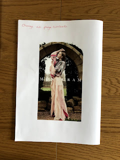
Second Print Test

Once I had amended the issues that had been identified in the first draft of the magazine, in terms of both design and content, I presented the draft to Amber within a crit who approved to the overall appearance of the design itself. Before uploading the PDF and sending the document off to print, I decided to print the entire document once more at home, ensuring that the new order of content flowed well, as well as ensuring that all of the changes had been made in a physical and tangible object that I could make notes on. This process minimises the chances of anything going wrong during the production stages, something which I was keen on doing as the magazine was being printed externally. 


  1. Add correct page numbers.


  1. Get rid of illustration.


  1. Change wording


First Print Test

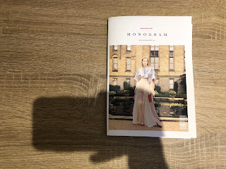
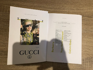
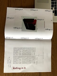
In order to gain an understanding of what the final printed product would be like to sample as a consumer, I decided to print a draft and to check over the design elements of each page to evaluate and react to any changes that need to happen before sending off the final file to the printers. This was printed on the same scale as the final piece will be to also allow me to evaluate any sizing issues that may occur.


  • does the title of the seasons need changing for when it will be printed? or since it is being printed in the winter should it be looking towards the next coming season.


  • All page numbers need checking against the final design in case any pages change order.
  • Titles need to change to ensure they are the same as the ones at the top of the page.


  • Page numbers need centring on all pages.
  • Quote marks around the title as it is a section of the poem itself.
  • Move this spread to the centre to create a divider between the information and how to combat it.


  • Lower case on the large text as it is part of an ongoing sentence. 
  • Capital letters on the large text on the right-hand side as it is the beginning of the sentence, that relates to the other text on the other side of the spread. 


  • Even space between the page title and the artist name.
  • Lowercase to 'r' on rolling in it, as it is part of an ongoing sentence.


  • Caps are needed for each of the large text statements on the left-hand side as they're statements that don't relate to any of the other text on the page.
  • The main body text must be moved down and aligned with the counterpart.
  • 'L' on liked must be made lowercase as it is a continuation of a sentence.


  • It's changed to it is, to make it clearer for the audience. 
  • The illustration should be changed to make it more appropriate to the body text. 


  • Space to be equalled between the page title and the artist's name.


  • Is an illustration needed?
  • Letters have been dropped to put the focus back on the person in the image rather than the clothing they are wearing, to visually represent the change in tone of voice. 


  • Is an illustration needed?


  • Logo must be inserted above the image. 
  • Is an illustration needed?


  • Add illustration.